How to Curate a Cohesive Gallery Wall
In short…have at least one common theme. This could be the same frame, artwork type or colour scheme.
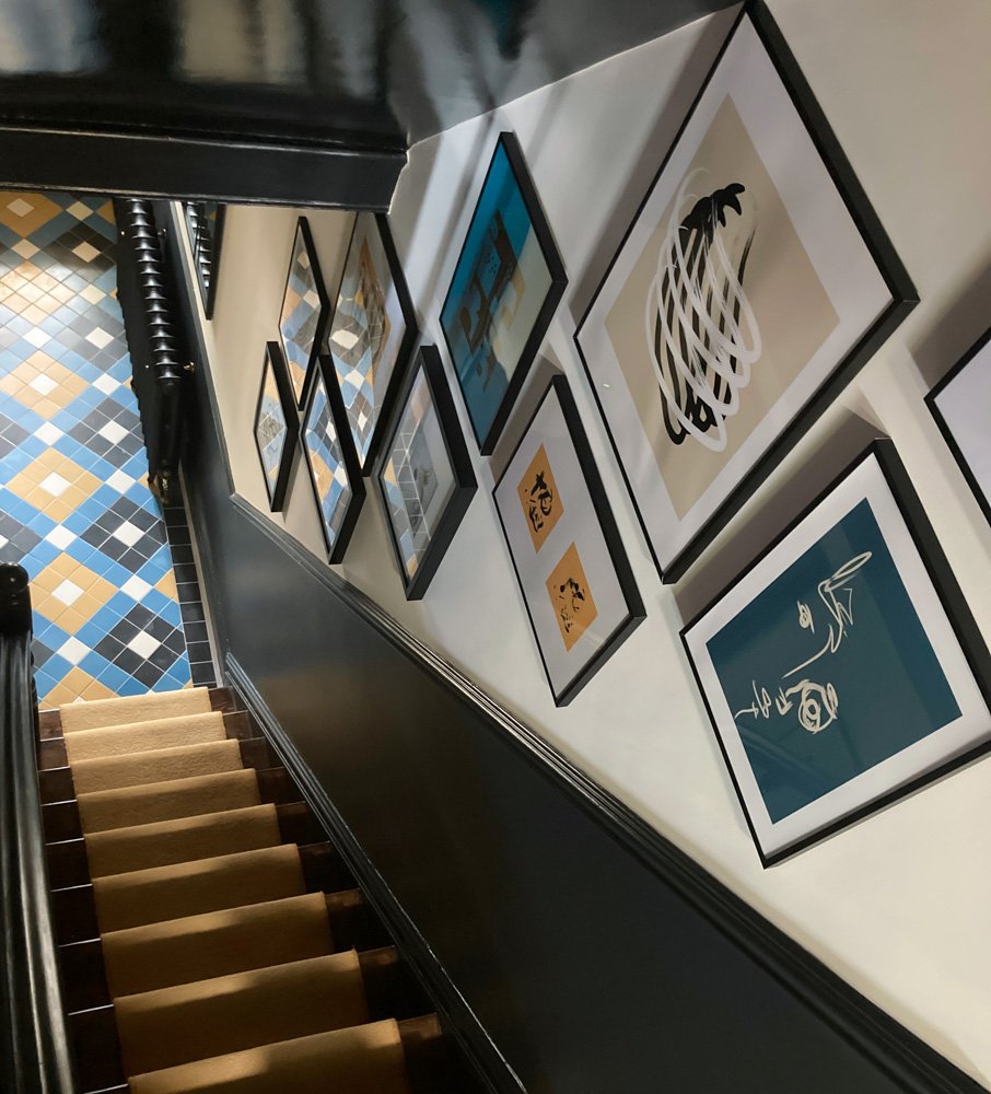
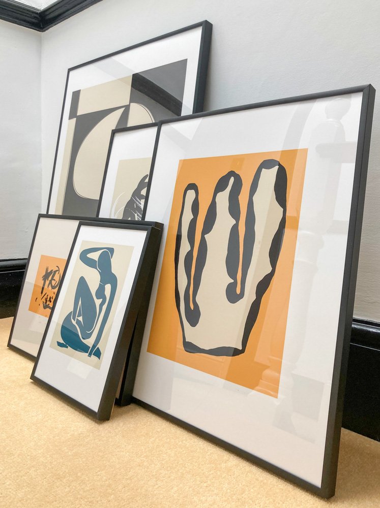
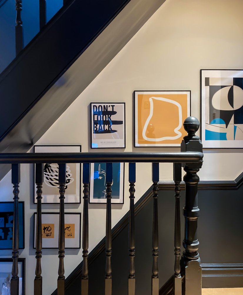
For this staircase gallery we’ve used the same thin black metal frame throughout for cohesion, but in several sizes to create variety. The artwork is mostly illustrations, with some typography and photography thrown in for contrast. We’ve also used a colour scheme which compliments the hallway décor, picking out the blue and yellow tones from the flooring. If the room already features prominent colours, it’s best to work with these in the artwork, rather than fight against them.
When it comes to the layout, staggered is best for staircases, working with the incline. I personally allow 80mm between frames to allow each piece of art its space to shine!

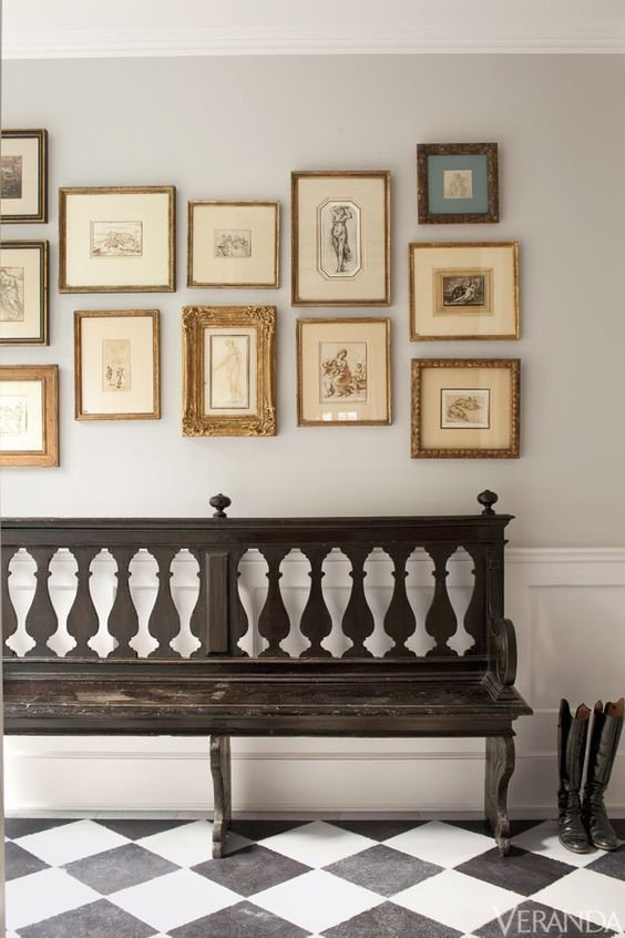
Gallery Walls with Mismatched Frames
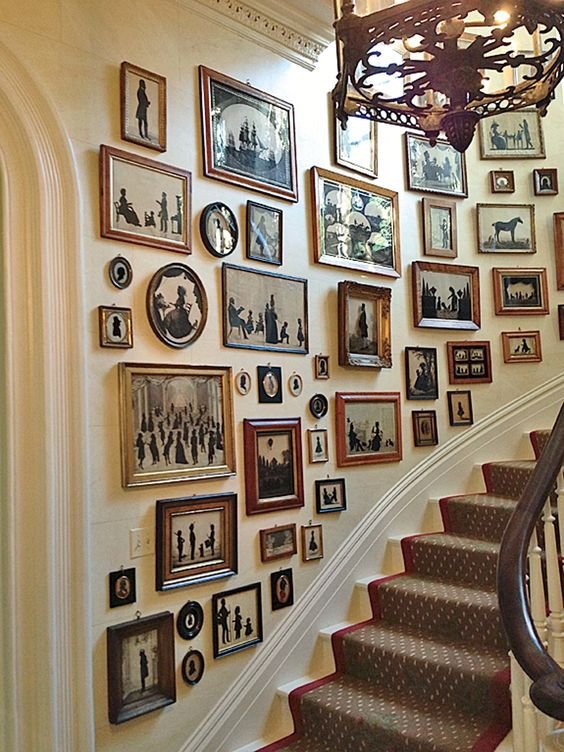
If you prefer to collect frames as you go, use the same artwork type throughout the gallery, to create cohesion this way. An example of this which is always stunning, is odd vintage frames with black and white photographs.
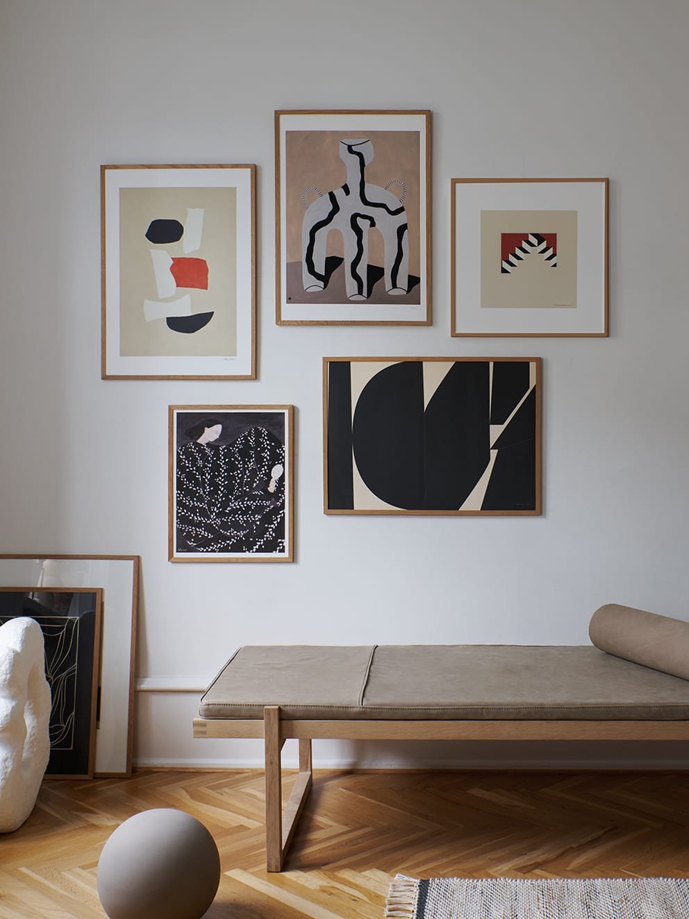
Gallery Walls with a Colour Theme
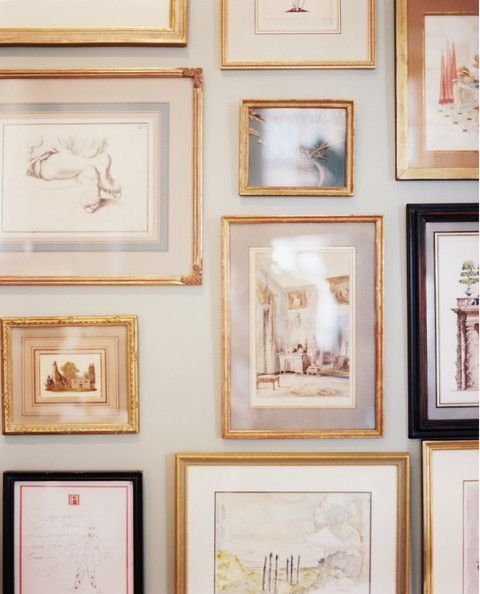
If you’re creating your gallery wall from existing frames and artwork, the best way to ensure cohesion is to work with a colour scheme that compliments your room. For example, let’s say your decor is neutral with black furniture, and you’d like to add some warmth with the artwork. If we choose a rusty red as the accent colour, we can also bring in burnt oranges and soft corals which work together tonally, alongside the monochromes.